Extending an Edwardian Semi

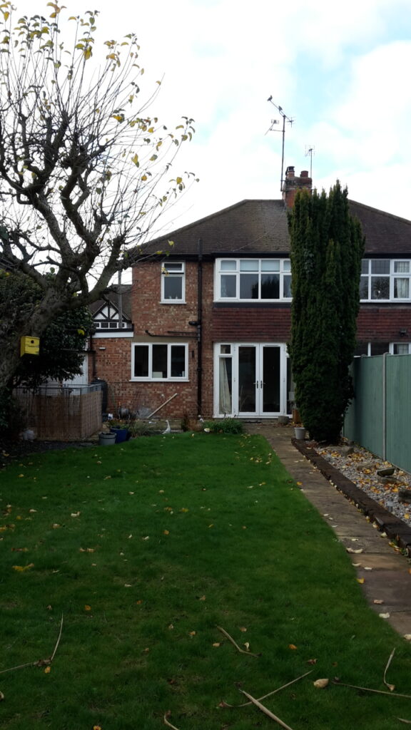
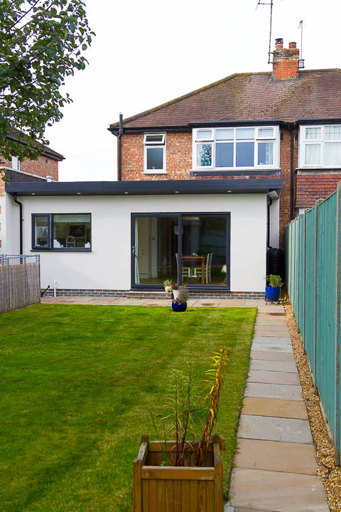
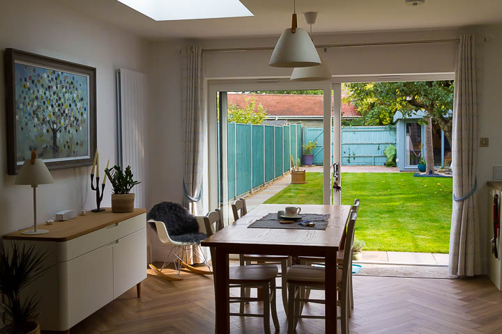
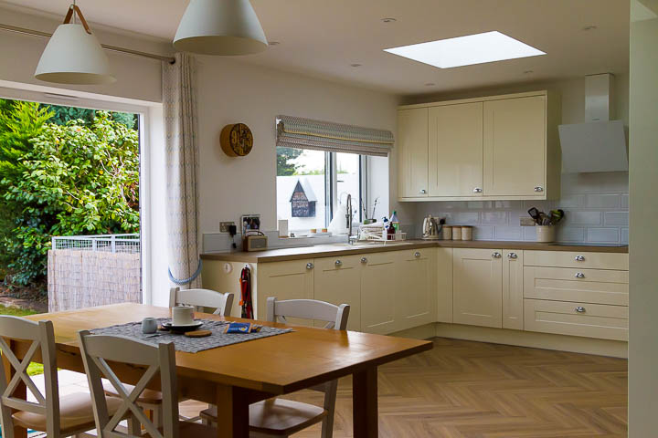
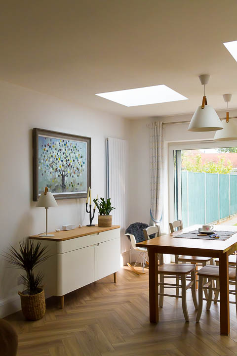
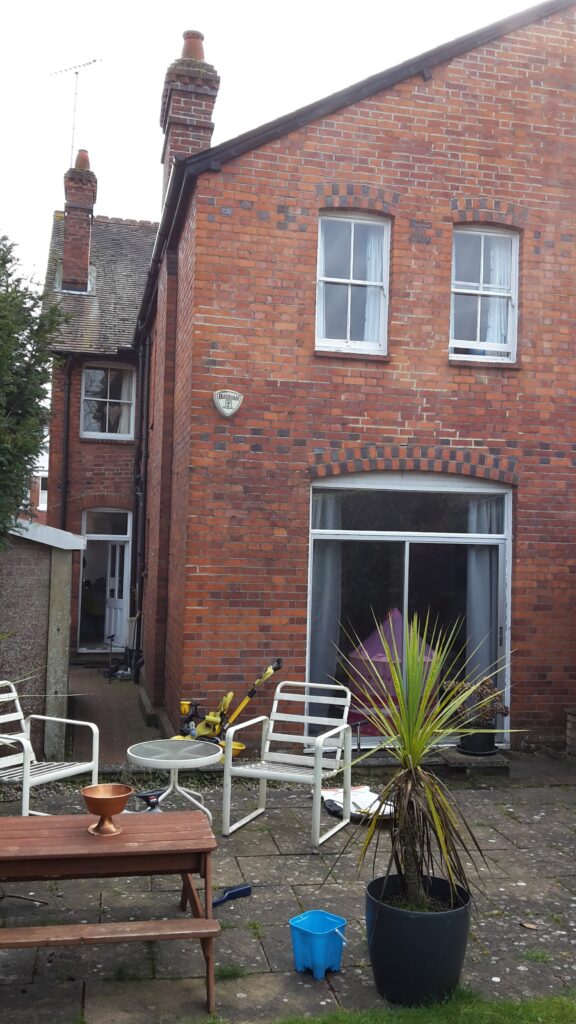
A sizeable semi-detached property, this Edwardian Semi was built for a different way of living. This family of five came to me to help them reconfigure their home for the 21st century.
Setting the Brief

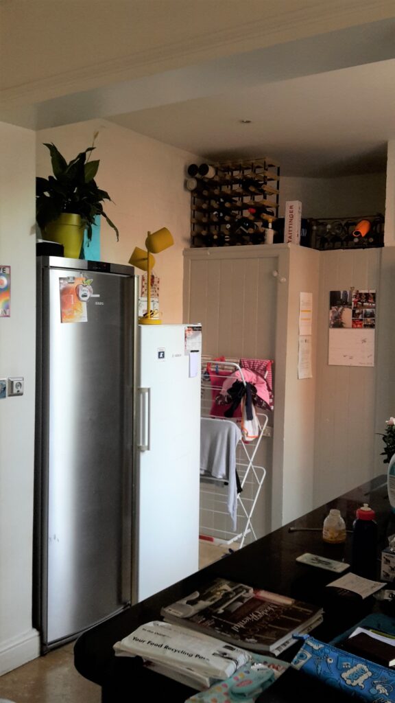
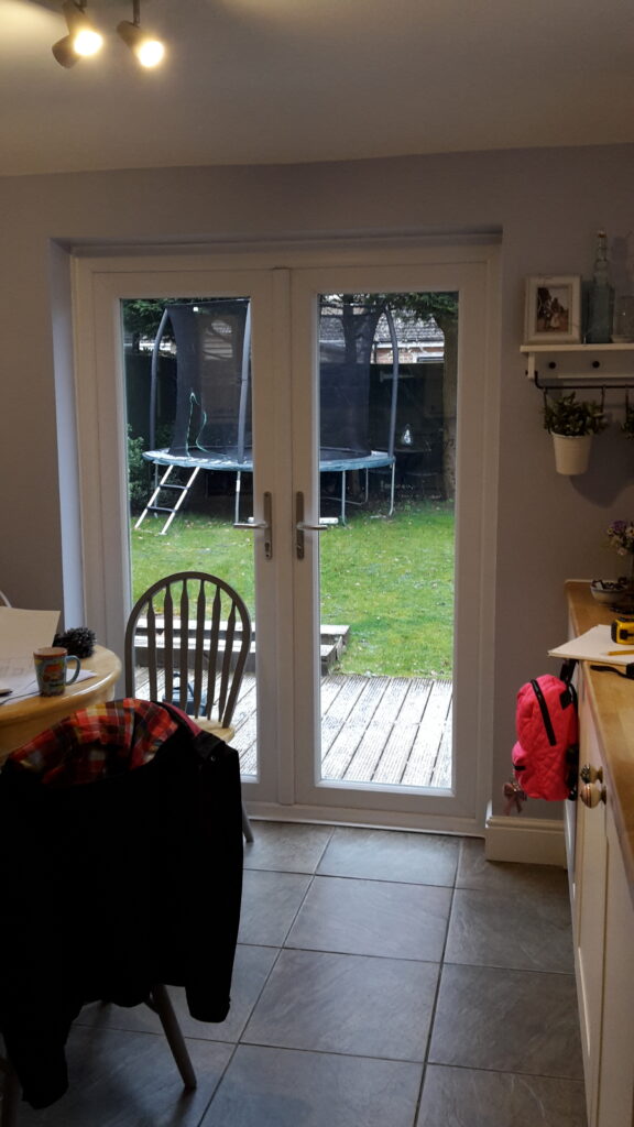
Fed up of squeezing round the low level island for family meals, amidst the clothes washing, it was time for a change. Their requirements were for a large kitchen/dining space for five to cook and eat together, it should be somewhere to entertain. And also a flexible space for working from home, a library, making lego, stuff with glue! They wanted huge doors and windows with character and for the extension to feel solid and part of the original house (not a glass box on the back).
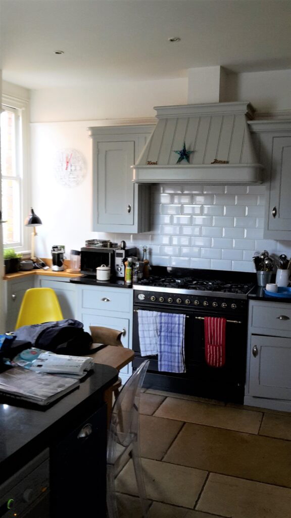
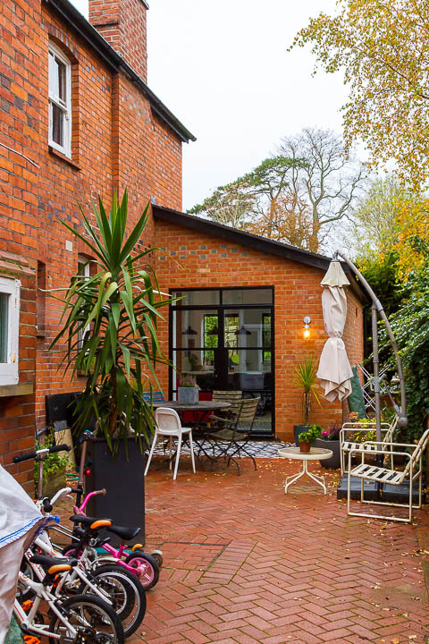
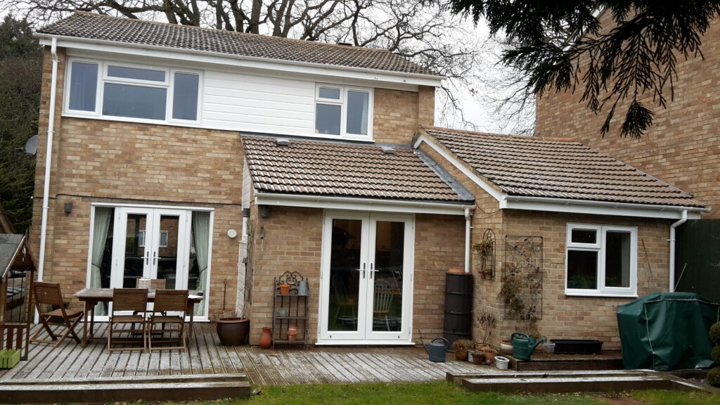
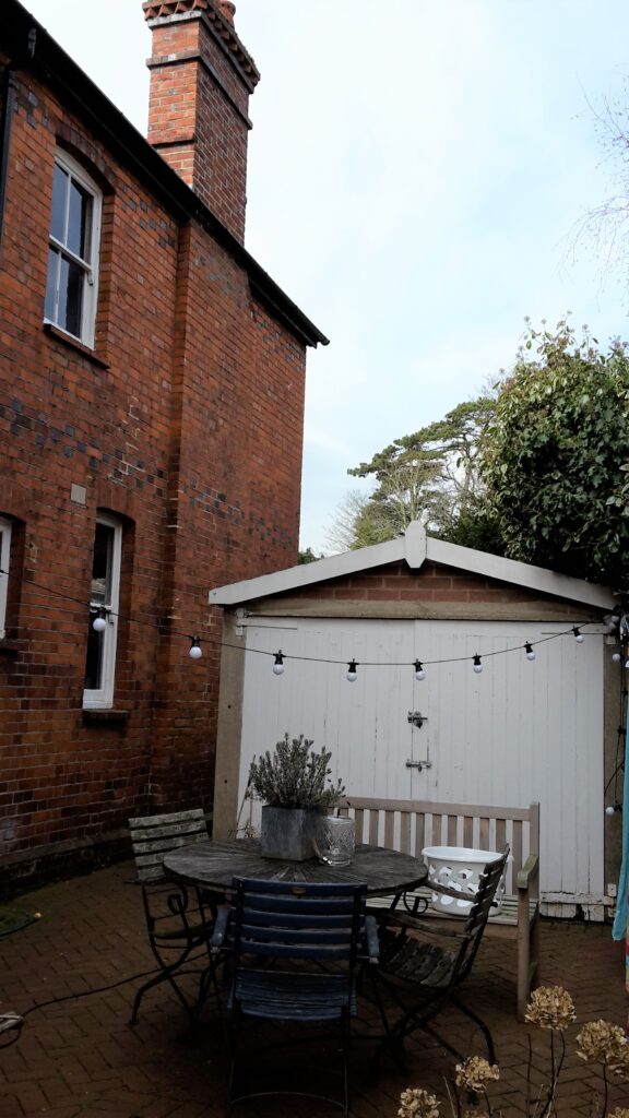
Notwithstanding a 180ft garden, the rear of the house was North facing and they were particularly fond of the South facing courtyard to the side of their house. They already liked to hang out there, despite the “awful concrete garage, we could do without”. We set to work to make this space an integral part of the design. It was to become “a sunny outdoor courtyard for eating alfresco and working outside in the summer” (British weather permitting).
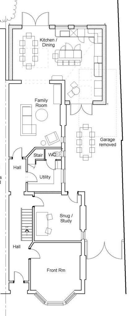
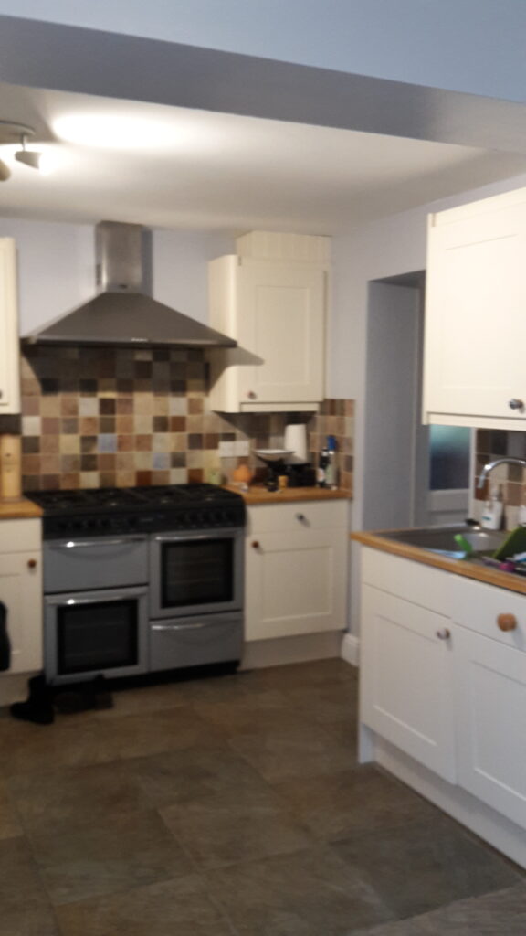
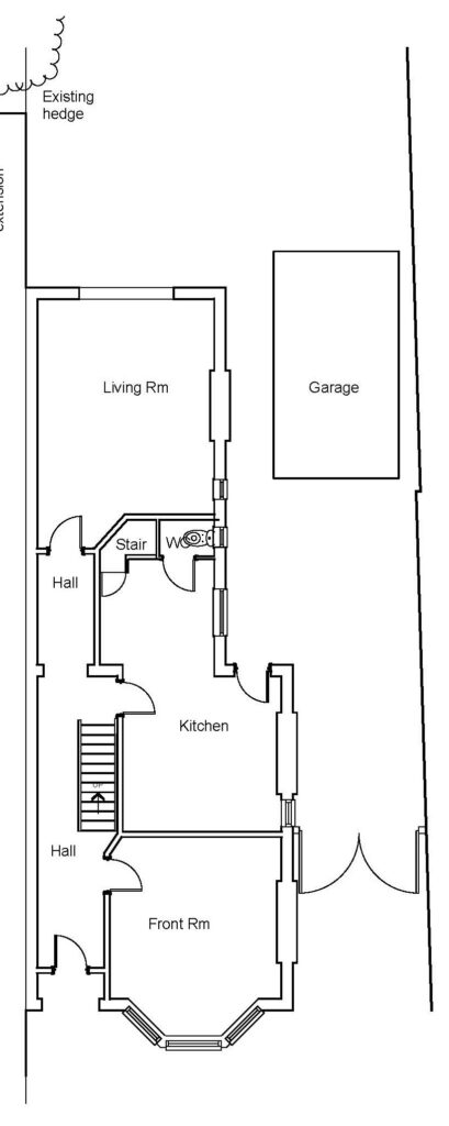
The ground floor had the original kitchen set in middle of the house between large reception rooms to front and rear. It needed a new layout to reconfigure their home for today’s way of living.
Transformation

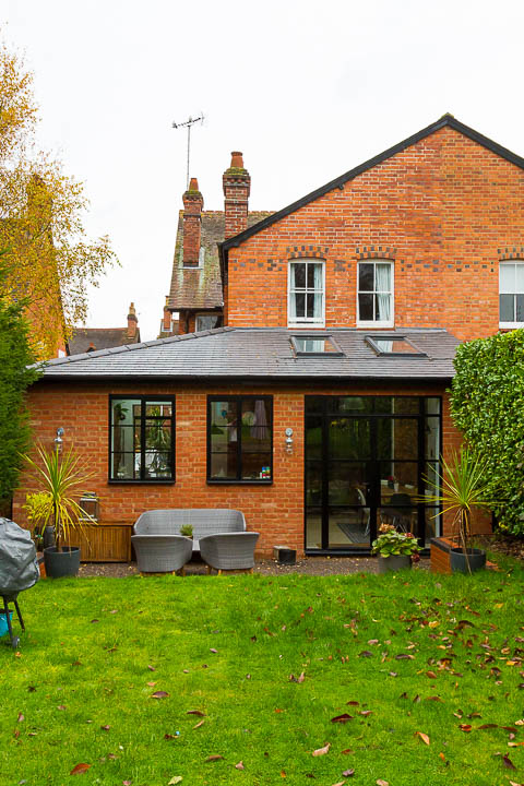
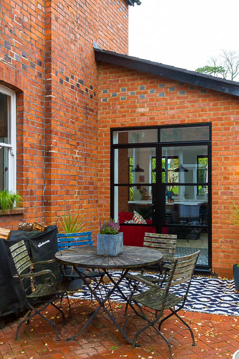
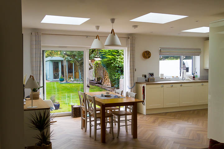
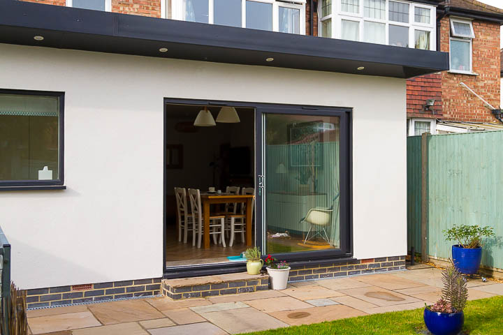
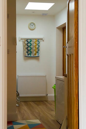
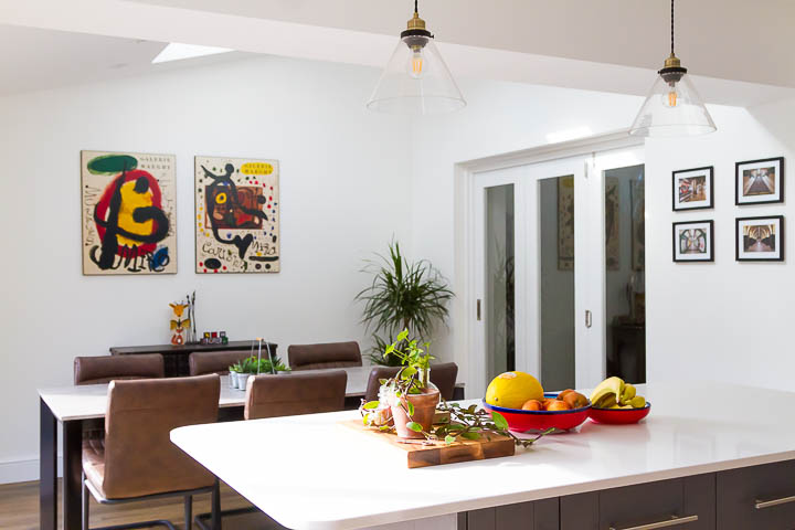
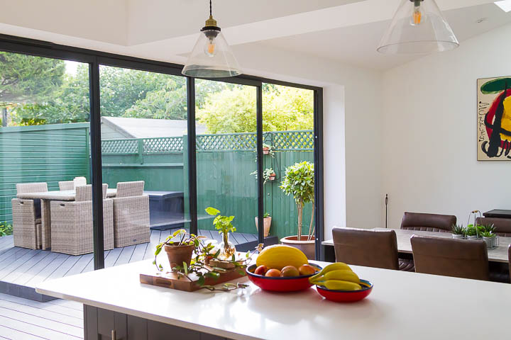
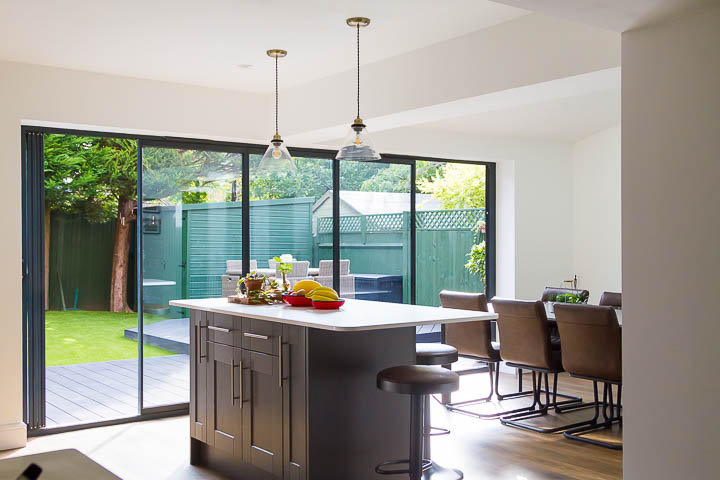
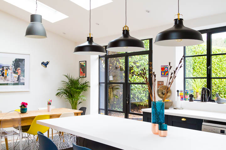
Extending to the rear and to the side of the house, we created a double aspect kitchen, capturing sunlight from the south side and connecting to the much loved side courtyard, all the better with garage now gone. The old kitchen became the utility room and study, which also opens to this space.

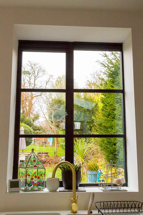
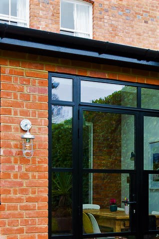
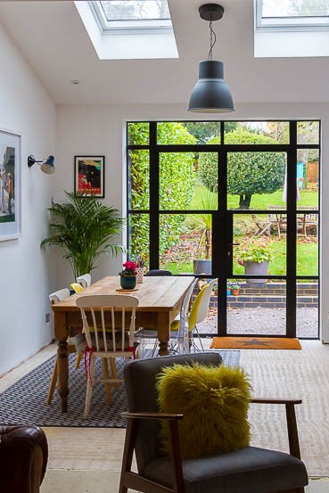
The doors and windows, taller than standard height, have an old steel frame appearance but are actually aluminium frames which are thermally better performing. These were sourced by the client from IQ glass and are a real focal point of the space from both inside and out.

The exposed brickwork within the kitchen retains some character of the original property within the new space and is a beautiful contrast to the otherwise gallery like white space.
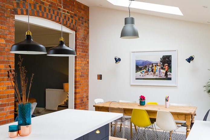
Finishing the kitchen just a day before their wedding, a no doubt busy last few weeks, but a wonderful space for an informal reception and a great excuse to invite guests and entertain.
This project completed Summer 2019 and was built by A. Pearce Builders.

Products and Suppliers: Kitchen – Howdens, Pendant Lights – IKEA, Roof lights – Velux, Doors and Windows – IQ Glass.
2020 – What a year!

Far from the doom and gloom that March predicted, 2020 has been real success – here’s how things panned out for me…

(more than) A few wins:

  • I focused on working with clients from concept right through to completion to ensure they get the best outcomes with the least hassle.
  • I blogged regularly on all sorts of topics from Mistakes to Avoid to Lighting and Storage.
  • I started a Facebook group to help people get clued up before you begin.
  • I gained nine 5* Google Reviews.
  • I developed a collaborative approach with structural engineers Michael Aubrey Partnership to bring structural input to the early stages of design. As well as enabling clients to reduce overall project fees by avoiding duplication of effort.
  • I worked with business coach Gemma Gilbert and soaked up her brilliance to get all of the other stuff done.
  • I ran a 100km in October and raised £650 for Breast Cancer Now.

A few challenges:

  • I took on a little too much work, everyone being at home all the time sent enquiries sky rocketing! Fortunately, I was able to work with others to help me deliver it all.
  • I didn’t implement my new CAD software, the task seemed mammoth and I didn’t break it down into small enough chunks.
  • The COVID restrictions meant I wasn’t able to visit previously completed projects as much as I’d hoped to, so the case studies remain outstanding.

What did I learn?

  • That most things are possible if you put your mind to it.
  • That content marketing is actually just about sharing value and connecting with people.
  • That virtual meetings can actually be quite productive and save on travel time!
  • That systems are key to efficiency and I wouldn’t be without Dubsado.
  • That I need a little bit of human support too, and am pleased to be working with Admin Lab helping me keep on top of it all.
  • That maintaining good relationships with contractors is just about picking up the phone.
  • That sending chocolate brownies to clients in the post when they’re having a rough time is always a winner!

What does 2021 hold?

For me 2021 is about changing focus with my project work and bringing energy retrofit to the table alongside extension projects. I want to help people make their homes greener. I’ll be completing the AECB’s Carbonlite Retrofit Course to develop my knowledge in this area and will be seeking clients who are keen to embrace a sustainable design agenda.

I’ll be implementing the new software I’ve been avoiding, by taking it in bite size chunks, and look forward to seeing the benefits it will bring.

Most importantly? I’ll help my clients get their dream homes built.

On reflection

It was far from the easiest year, with our kids home for what seemed like eternity, but somehow all that stuff got done. I’m excited to embark on 2021, but far from wishing 2020 away on reflection it’s been quite a success.

1930’s Home Extension in a 2020 Lockdown Situation

Completed during the COVID lockdown, a few compromises were required to maintain momentum, but they got there in the end. As a client with project management skills in their own field, I wasn’t involved throughout the build, so I visited them back in September to see how it had all turned out.

“Actually having you visit makes us a bit reflective. It’s sometimes hard to appreciate the end result when you’ve lived through it but looking back it’s quite the transformation actually.”

Motivation

With a tight kitchen and an under used separate dining room, the initial motivation for this project was to create a larger open plan kitchen dining space. The addition of a seating area, ground floor loo and utility room, brings this three bed 1930’s home up to speed with a more contemporary way of living.

Conscious that we were chopping and changing the original layout, we chose to push all the beams up into the ceiling void, with the benefit being that the new spaces flow from the old house right into the extension without interruption.

When you think that the whole of the kitchen used to be in what is now the utility room and ground floor loo, it’s amazing to see the difference. The new kitchen is spacious and bright, with the dining table serving unexpected dual purpose as a work from home space as the world of work continues to evolve beyond the initial project brief.

A challenging journey

Whilst the spring lockdown stopped the building work initially, it soon resumed with the construction industry carrying on as near to normal as possible. However, temporary closure of builders merchants, and paused manufacturing of some key elements, did impact the project:

“We had to change the doors and windows from aluminum to PVC because during the lockdown we couldn’t get them supplied from the people we wanted to. It was a decision we made because we didn’t want our build to take another two months.”

“We had some unexpected challenges with the kitchen installation but the end result is great. The flooring came from an online supplier because we couldn’t visit any showrooms at the time.” Having lived through every minute of the project, being at home throughout the build, my clients were somewhat relieved when it all came together at the end, after several months of washing up in the bath.

Transformation

Despite the challenges along the way, the finished extension is a real transformation from how the house used to be: “We’re really pleased with how it’s turned out, we basically live in the extension now”. The original front room which was retained can double as a spare room for guests in the future, and for now, provides a space for some privacy away from the open plan rear of the house.

We talked about some of the smaller things that make a big difference to how the house functions now and I was pleased to see that these design elements had been retained and not omitted in lieu of cost savings. Both daylight and artificial light being important considerations:

“Having the roof light in the utility room makes such a huge difference for what is essentially an indoor room, we now have daylight and ventilation here, we chose to opt for the roof light with electrical operation, which has been really good on some hot days.”

“We really like having our lights on different circuits so that we can create different moods”

Overcoming the cramped feel of a “kitchen made for one”, the new space is generous and somewhere to be enjoyed together, and eventually with family and with friends.

Building work completed summer 2020 by Steve Tyler and Sons Builders.

Products and Suppliers: Pendant lights – John Lewis, Kitchen – Wren.

Where’s the Fish Tank?

“Where’s the fish tank?” I asked. It was one of the things I remembered from the old dining room. I suddenly realised that we hadn’t planned a spot for it in the new extension. Sadly, (although somewhat to my relief) the fish had not survived the building work. I felt somehow thankful that they did not need a space for the tank, but also guilt at my relief! I made a mental note to add ‘fish tank’ to my project checklist, it would be there along with cat flap, and the myriad of other things that need to be considered. I would not want to forget the fish tank again.

Not to downplay the loss of a pet(s), but the sadness was quickly replaced with a sense of pride from visiting the finished home (and envy – I wanted to move in!). I entered into the new extension on a sunny Monday morning after the school run – it was bright, spacious, beautifully furnished by my client – with great eye for detail.

Catalyst: A Bigger Bedroom

When I met my clients back in 2018, the original brief had been to create a larger third bedroom for their son – to extend above the existing dining room extension. Their 1960’s home had good sized rooms, albeit the third bedroom being on the smaller side. Once the process began, the realisation dawned that if you’re going to do building work, you’ll probably only want to do it once. With that, the scope expanded to extend the ground floor and renovate the kitchen as well, they wanted a space to entertain especially for family at Christmas.

Before it all began

Journey: Some Twists and Turns

With a revised brief for a larger project we set off on a journey which had its twists and turns. A hundred year old oak tree in the front garden and the house having been previously underpinned due to subsidence added some complexity to an otherwise straightforward project; the structural engineer designed for piled foundations. The need for a specialist piling contractor alongside a general builder made for additional coordination.

Result: A Space to Entertain

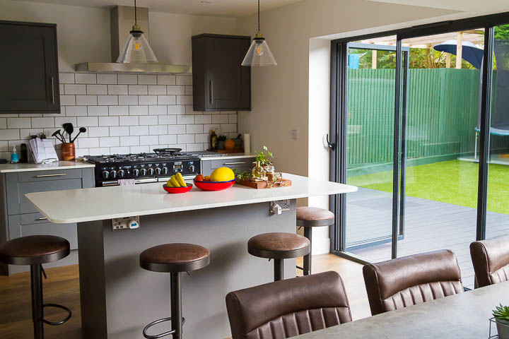
Obstacles overcome, the outcome is lovely, a space for the family to enjoy and to entertain. The only downside being that COVID has limited their potential for visitors, but this will no doubt be a great entertaining space when the time comes.

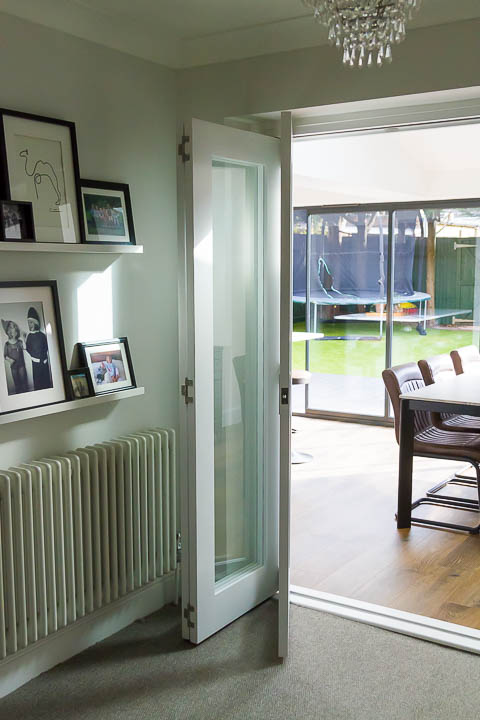
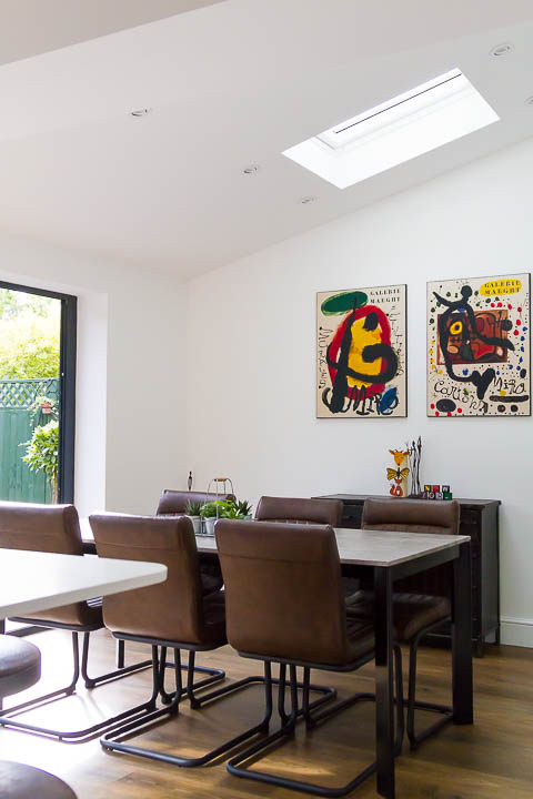
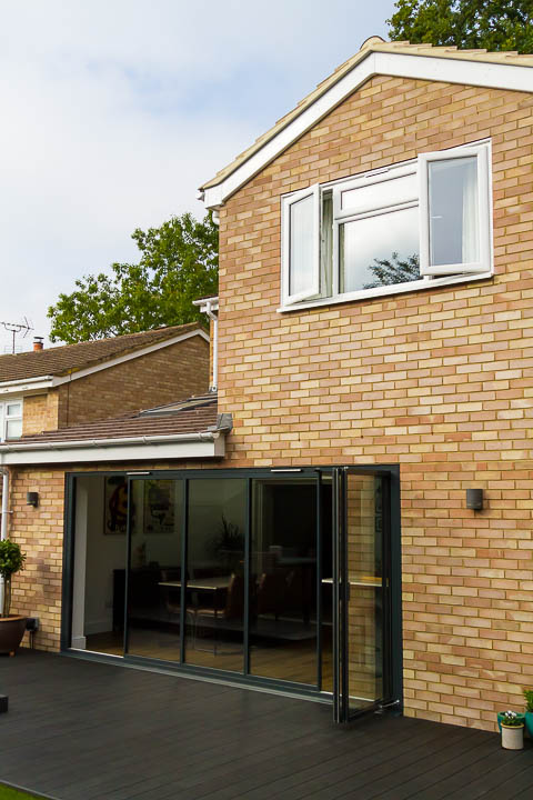
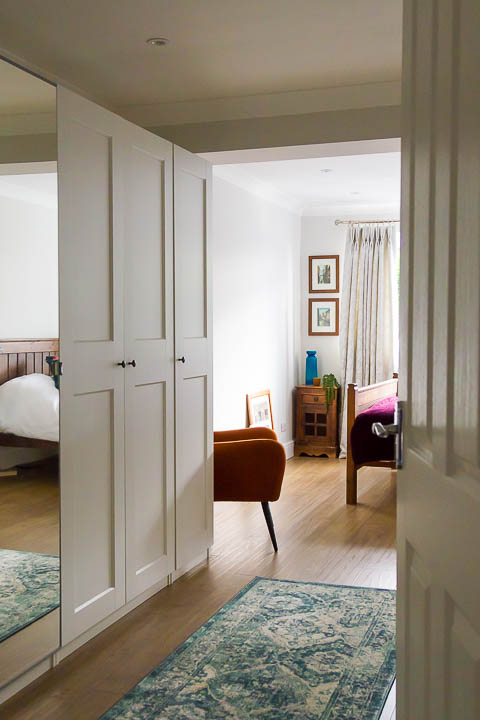
The ‘slide and fold’ doors across the width of the space, adding elegance with their slim frames. The internal bi-fold doors between lounge and dining bring flexibility for open plan or closed off living. The roof lights enhance the dining space, bringing light from above. Upstairs, in the two-storey part of the extension, the enlarged third bedroom had been commandeered as the master, with a walk through dressing area adding some glamour.

“The house is finished and we love it!” That’s the feedback I love to hear. And whilst the end result is very much the point of hiring an architect, it’s good to have positive feedback on the journey to get there as well:

Carly was sympathetic to our needs, very organised, has great communication skills and went above and beyond when working with contractors. She made the whole process as seamless as possible and we stayed on budget throughout. We are extremely pleased with the service she provided and are really pleased with our 2-storey extension.

Building Work completed early 2020 by Duncan Crawford.

Products and Suppliers: Kitchen – Howdens, Worktop – Rocktops, Kitchen Flooring – Amtico, Pendant Lights – Koltrane Lighting , Bedroom Flooring – Quick Step LVT, Rooflights – Velux, Slide and Fold Doors – Sunseeker Doors, Internal Bi-fold Doors – Todd Doors.

How do the kids feel about extending your home?

Change can be challenging, especially with kids, here’s why involving your kids can be an important step when undertaking an extension project. I sought some expert advice on how best to approach things…

Excitement

It’s exciting isn’t it? Planning an extension project. You’re going to change the way you live, overcome those awkward parts of your home, improve functionality, create more together space and bring harmony to family life… well that’s the plan!

How do the kids feel about it? Have you asked them? Maybe they’re excited too or possibly a little bit worried. Getting a new bedroom sounds like fun doesn’t it, but have any of you thought about the disruption you’ll go through before the flat pack furniture building begins?

There are hundreds of decisions required to build your new home and whilst you might want to involve the children with some of them, you’re likely to overwhelm them if you use them as a sounding board for every last fixture and fitting.

Disruption

Children, on the whole are pretty adaptable but if you don’t help them through it then you might find the build phase more stressful than you’re expecting. Working around less space and a temporary kitchen is an obstacle, but can be overcome. Living together in just half of your rooms whilst the others are knocked about is only fun for a little while. Everything takes time.

Dust gets everywhere. You can tape things up as much as you like, but it will be settling for months afterwards, so there’s no escaping it. Construction is also very noisy and if you’re going to be around during the daytime you might find this quite the distraction. Perhaps moving out is an option, but there might be a cost with that. If you are planning to “live on a building site”, it’s important that you understand the risks and that you communicate with your builder’s team to ensure that you are able to keep the children safe.

Strategy

Starting right from the outset before the build commences, how can you manage this changing time with the kids? What can you do to help them feel excited whilst at the same time building resilience to cope with an unusual situation? I spoke to Sarah Billingham of Confident Kids, a specialist teacher who had this advice:

“Whenever there is going to be a big change for children, we tend to jump into telling them all of the things that will be different. Instead, start by telling them what will be the same so that they have some sense of familiarity. Slowly introduce them to the things which will be different so that they have the opportunity to process each aspect without becoming overwhelmed. One of my favourite ways to explore the topic of change is to share stories together on the topic of the change ahead (in this case- building houses!). This helps children to get a sense of what to expect and the equipment they might see. Children can explore and talk about the change in a non-threatening way. “

What your Conservatory is saying is “Replace me”!

Conservatory: lovely concept but far too hot in summer, too cold in winter. Terrible thermal performance is the number one reason to get rid of it, that’s what it’s trying to tell you! But take care not to replace it with an extension that is glazed to the extent that the same problems might persist.

Poor Performance

Designing a new extension to replace a conservatory is a brief I’m commonly presented with. The main reason cited for replacing it is always poor thermal performance, don’t get me wrong – conservatories have their place but they aren’t very functional for year round family living and if yours is a dumping ground for toys and garden paraphernalia, fear not – there are others out there just like you.

That said, there are some huge advantages in terms of light that come from a fully glazed room. And in replacing a conservatory it’s often the case that you’ll want to go for as much glass as you can, which could in turn perpetuate the same conditions. Fortunately, the Building Regulations have some criteria to help you avoid this in terms of amount of glazing that is permitted before you reach a tipping point. After which you’re required to mitigate your excess glass by “over insulating” other components to compensate, although this is more in relation to heat loss than solar gains.

There are lots of options including triple glazing and solar control coatings to help improve the performance of your glazing and the orientation of your building will be a key factor too. The angle of the sun comes into play somewhat in the UK where it’s low and weak in the winter (desirable) but high and hot in the summer (problematic). If your main elevation is south or west facing, you’ll need to consider the design quite carefully to avoid overheating in the summer months. Solar shading in the form of a roof overhang or vertical fin might be an appropriate solution.

Panorama Overdose

Rarely do people say “I want to replace my conservatory becayse I hate looking at my garden”. But it’s worth considering, do you want to look out on all of your garden or just the best bits?

Frame a view of something worthwhile, mask out the ugly bits. Yes, the apple blossom is nice but do you want to look out at your knickers on the washing line when you’re sat on the sofa… when your friends have popped round to admire your lovely new extension? Maybe not.

It’s also worth considering that floor to ceiling glass can play havoc with your furniture layout, see also Is Open Plan Always The Answer? where it turns out walls have their place.

Everybody loves good neighbours

“We know them really well, they’ll be fine with it”

That’s what I commonly hear when I ask how the neighbours will react to the plans for extending your home. It’s amazing how perception can sometimes be so far from reality and that’s why chumming up with your neighbours in advance of your building work is a strategic move.

Think about it, how would you feel if you saw your neighbours and their architect in the back garden waving their arms about, talking about building close to the boundary? You’d be twitching your metaphorical net curtains and perhaps rightly so. Generally people are resistant to change and predictably irrational if they don’t know what to expect.

Neighbours have the potential to make your journey from concept to completion a little bumpier that you might like, from Planning objections to Party Wall dissents they can throw more than a single spanner in the works. And whilst neighbourly Planning objections are sometimes discounted unless they’re made on policy grounds, it still doesn’t set you up for a very comfortable year ahead. Here are some tips on how to keep things on track:

5 Top Tips for Smooth Neighbourly Relations

  1. Inform them: well ahead of getting yourself an architect – let them know you’re thinking about extending, perhaps ask if they’ve also considered doing the same.
  2. Listen to them: are they concerned? If so, what in particular is an issue for them? When you come to appoint an architect, let them know about it so that they can consider how best to alleviate their concerns as well as meeting your brief.
  3. Share with them: once you’ve developed your ideas and have your plans ready – share with them, ahead of making a Planning application. There’s nothing neighbours like less than being ambushed. The local authority will let them know you’ve made an application, so get in before they hear it from somebody else.
  4. Involve them: dependent on the scale of proposals and whether it does impact them in anyway, you might consider tweaking your proposals a little in response to their concerns. I’ve had several meetings where getting client’s neighbours round for a cuppa has allowed us to mitigate any objections by simply taking their concerns on board in the first place.
  5. Manage their expectations: let them know when you anticipate the building work to be, let them know ahead of time that you’ll be sending a Party Wall Notice and what the process is.

It’s not about designing your extension by committee, and it’s not about foregoing your own aspirations to please the neighbours, but as with most things in life, communication is key to success.

5 Ways to be Smarter with Small

Let’s face it, bigger is not always better. In my experience design is often far more intentional when something is small. Firstly, with fewer things to consider each element naturally affords an greater level of attention. Secondly, because there is a need to squeeze functionality into every inch of space. Here’s 5 Ways to be Smarter with Small…

It’s definitely in here somewhere…

1. Under Stairs Alternatives

Tell me we’re not the only family constantly turning out the understairs cupboard to find shoes, shopping bags and a million other odd bits? Yes, it’s a big cupboard but functionally it doesn’t serve us well. You know it’s all in there somewhere, but unless you’re super organised it’s pretty hard to find what your looking for, especially as the space is cramped.

However, the space under the stairs – if thoughtfully designed – has potential to accommodate all sorts of things. There are lots of clever solutions for storage but if you can accommodate the clutter elsewhere there’s also the option to use this nook for something different. Perhaps a desk space for homeworking or a cosy reading den? Pinterest is a great place to search for under stairs ideas, checkout my Under Stairs Ideas board here.

2. Compact Utility

I’ll let you in on a secret, those people with the tidy house? It’s all hiding away in the Utility Room! There are lots of reasons to have a separate utility room and it doesn’t have to be massive. Firstly you can hide away all those things that don’t have a home, the kids craft projects that are drying, until such time that you can recycle them when they’re not looking! Secondly, you can use it for Utility stuff – you know, clothes washing and the like. Even a small area separate to the kitchen is worth considering – it will help to reduce noise for one, especially important if your kitchen is open plan to your living area. With stacked appliances (although do you even need a dryer? Save the planet and use a washing line) you don’t need a lot of space for your compact utility, just be sure to get the ventilation right. Find some inspiration for Compact Utility here.

3. Built in Storage

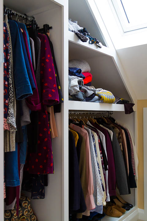
Ultimately you do reduce the size of a room with built in furniture, but the functionality you’ll gain and space you’ll save over loose furniture may well be worth it. Bespoke solutions are ideal for compromised spaces, such as loft conversions where you really need to max out the potential of the eaves. The creation of a walk-in-wardrobe frees up the bedroom to be much less cluttered – think of a walk-in-wardrobe as the utility room of the upstairs!

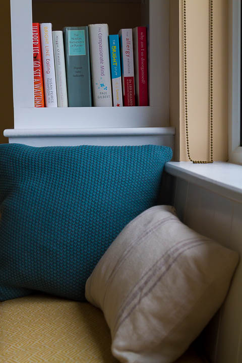
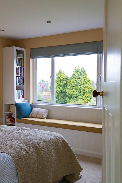
Window seats bring another opportunity to integrate storage. This dual functionality can come at a price, but being clever with storage can create a less cluttered environment to live in, and for me at least clutter = stress!

4. Precision Planning

When it comes to fitting things in, don’t forget the details like the thickness of your skirting board, or the space that the door will need to swing open. These details can really impact a small space where every inch is precious.

5. Illusions of Space

If you want to create a feeling of space in a physically confined room, you’re going to need to think outside of the box, literally. Having a view out of the space through a window or two is key, it makes a connection with the world beyond. Takes me back to my studies on the concept of Prospect and Refuge… although that’s probably one for another day. If you can create spaces which are double aspect, even better. That might be as simple as a view of the garden and a view of the sky. Mirrors are another interior design trick for illusions of space and help with reflecting light too.

Small doesn’t have to be standard, make small special and functional with good design.

Design in response to context for the best outcome

Consider your home, why is it like it is? Probably the layout is largely just down to convention. Does it respond to context, orientation for example, any differently to the neighbouring houses? In this article I’m looking at how a large proportion of our homes simply follow convention, and how when extending or altering your home you have the opportunity to change this. Get the most out of your project by positively responding to context, as well as considering constraints.

A very potted history

Conventionally, home layouts, right from your Victorian terrace through to your fairly recent developer housing have little changed. With a front room, back room, kitchen, and bedrooms upstairs. Yes there are differences in scale but overall the functions are the same. The major changes to house design came with the introduction of indoor plumbing, first bringing your loo indoors and then eventually upstairs bathrooms becoming more common place. Our homes tend to have a clear distinction of public/private spaces – ground floor for all, upstairs for the occupants, unless your visitors need to use an upstairs bathroom, in which case you better hope you made the beds! Bungalows and even flats have a similar hierarchy but with less physical boundaries. Have you ever considered it another way?

Unconventional opportunities

I’m not talking about underground lairs or renovating shipping containers, balancing your house on a rock or some kind of mechanical Tracey Island. There are unconventional opportunities to be considered even with everyday homes. Maybe you’re fortunate enough to have great views from your home and you’d love an upstairs living space to take full advantage of it? Conventions are there to be challenged – sometimes there are reasons to do it differently and usually that’s about responding to context.

Context and constraints might appear to be one and the same, but I like look at context as something to respond to with positive interventions, to make a project unique and site specific. Whilst constraints usually fall more in the realm of being the most pragmatic way to approach things. Good design is a balancing act.

Context

Responding to context could be as simple as positioning a window to frame a view of a beautiful blossom tree. The window in itself isn’t a luxury, you’re going to need one but considering the wider context, the features of the garden as well as the internal layout, brings opportunity to do something a bit special; something more considered – designed. Orientation, working with sunlight is another contextual elements which can inform design but there are other less attractive aspects too which might included noise. In one of my current projects this has meant unconventionally positioning a bathroom on the front of the house in order to act as a buffer between a noisy road junction and the new bedroom beyond.

Constraints

Boundaries are often a physical constraint and one which can’t really be changed. Whilst other things such as drainage or structures can be adjusted with enough careful planning and budget. In one project, the constraint on the width of a new side extension brought about the opportunity to create a fabulous and unconventionally large bathroom with vaulted ceiling and roof lights, rather than simply squeeze the bedroom in to a tight spot.

Constraints are often linked to cost too, so it may mean making sensible choices about where to locate things to work with existing drainage, or to retain some structural piers to keep minimise expense. Throw enough money at it and most things are possible so you might say budget is the biggest constraint, other than regulations.

Good design is about creating a solution that works for the specific context and constraints of your site, not simply taking a cookie cutter approach. And remember, you don’t have to follow convention if there’s a good reason not to, be open to all of the possibilities.

It’s not all about daylight, especially after dark

Natural light, sunlight, daylight… when was I last approached by a client keen to optimise their artificial lighting? I’m not sure I have been. Yet, artificial light is equally important, and there is great scope for creativity. Rarely does it get the same attention as the burning ball of fire in the sky but do give it some thought, for the evenings, or anytime past 3 o’clock and early morning mid winter!

Set the tone

Smart bulbs tie together the colour of lamps, pendants and cabinet lighting with copper hues

Lighting can make or break a space. Perhaps even more than furnishings the lighting anchors the feel of the space, the mood – warm or cold, bright or soft, utilitarian or cosy. Colour temperature sets the tone of the space, makes you feel calm and relaxed, or focused. Not to mention you can get some killer light fittings, which with their own sculptural beauty are a focal point and an opportunity for you to turn your extension into an art gallery of sorts.

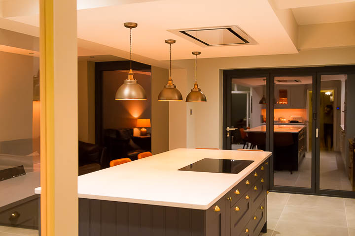
Pendants, popular, good over an island if it’s fixed but do take care if you use them over dining table if you’re likely to move it at all. You’ll probably need some other lighting too if the design of your pendants focuses light downward rather than being omni directional. Task lighting is useful but there will always be times when you will need a good light level over the whole space.

Pendants look great day and night, defining zones, with wall lights enhancing artwork beyond

Take care that your lighting scheme is informed by your furniture layout but make it versatile enough, zoned for different uses. Ceiling lights are a no-brainer in kitchens and utility areas, whilst wall lights or floor lamps may be preferred for living spaces. When it comes to fittings shop savvy, if you love something invest but remember light fittings are easy enough to change. Go and look at what you’re buying in person if you can – the world wide web has never ending options but be sure to consider the dimensions of what you’re ordering so that they don’t look out of place.

Practicalities

How your lights are wired on different circuits and switch positions is also worth considering. Do you want to be able to switch from more than one position (the typical hall/landing scenario), do you want some lights on and others off at certain times? It’s becoming less important as the use of smart lighting becomes more mainstream but don’t overlook it entirely.

Often it seems to soon to be sitting down with your plans, before you’ve even got your building, to be talking about lighting. Although getting something on your drawings to reflect your intentions, even if it’s not the final design will go a long way to getting your electrical costs tied down. Electrical works are often priced on a per point basis so making your intentions known will ensure the tender accurately reflects your aspirations and not someone else’s assumptions.

Light up the dark

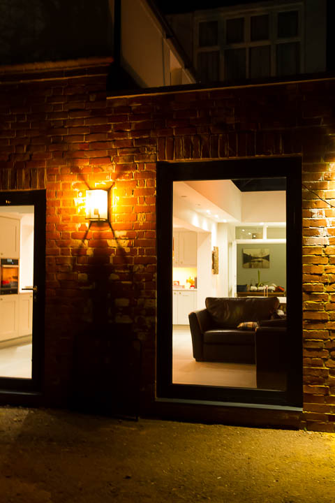
External lighting is often forgotten but will bring your extension to life in the evening. Be that some wall lights you can sit out with late on a summers evening, feature garden lighting to steps and planting or simply a light so you can see to out the bins out. Think through how you’ll use your home and capture those scenarios.

Get your artificial lighting right and your extension will be fabulous and functional, day and night.