10 design considerations for your home extension

As blogs go this is a bit of a lazy one, but it’s a quick read and there’s lots of photos to enjoy! Here’s 10 things that I think matter when it comes to home extension design…

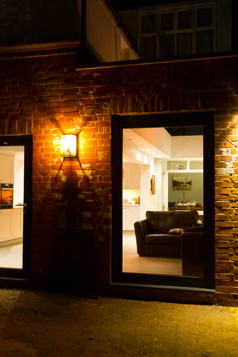
1) Original features are worth keeping

If you have great features, keep them. Work around your home’s beautiful bits .

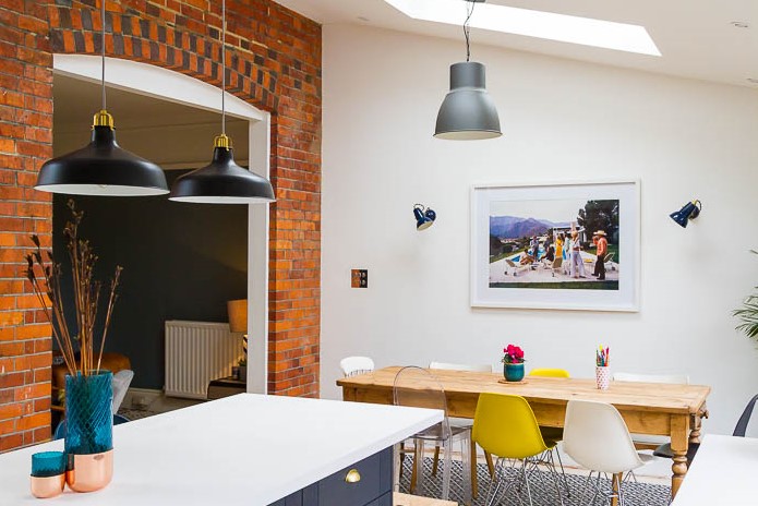
Exposed brickwork is a striking feature in an otherwise gallery like white space.

2) Bring it all together with a complete renovation

Nothing good to keep? A complete property face lift unites old and new, goodbye pebbledash

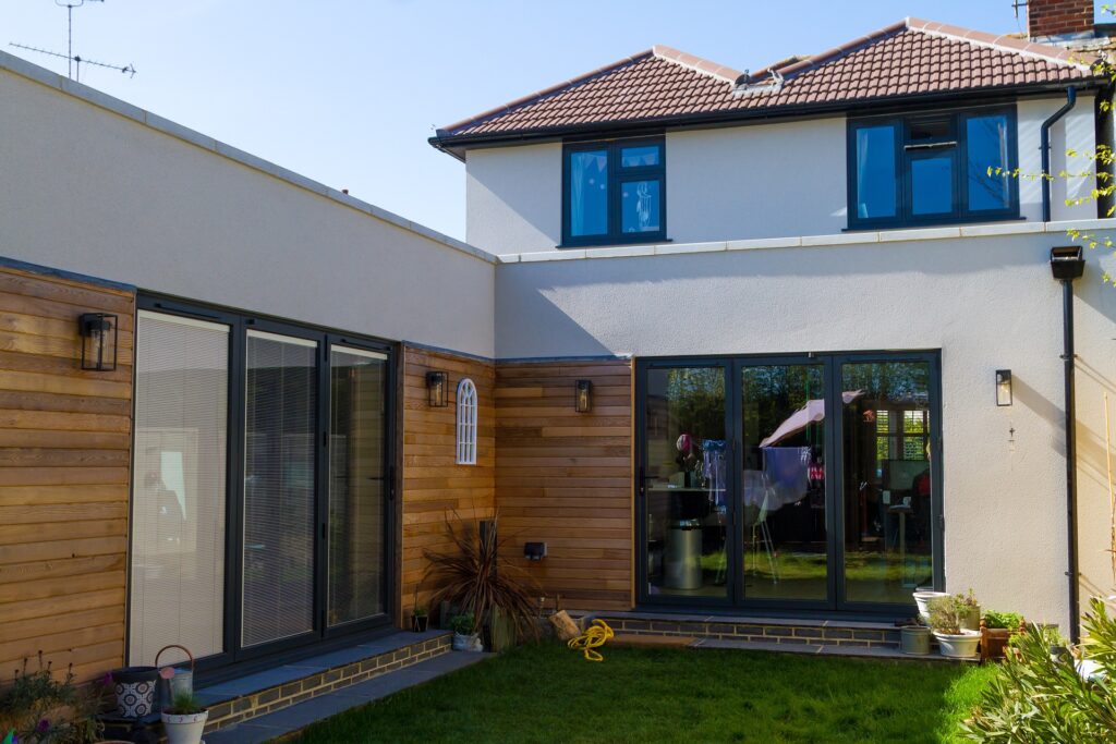
New extensions and a whole house face lift with new render and glazing bring everything together

3) Context matters

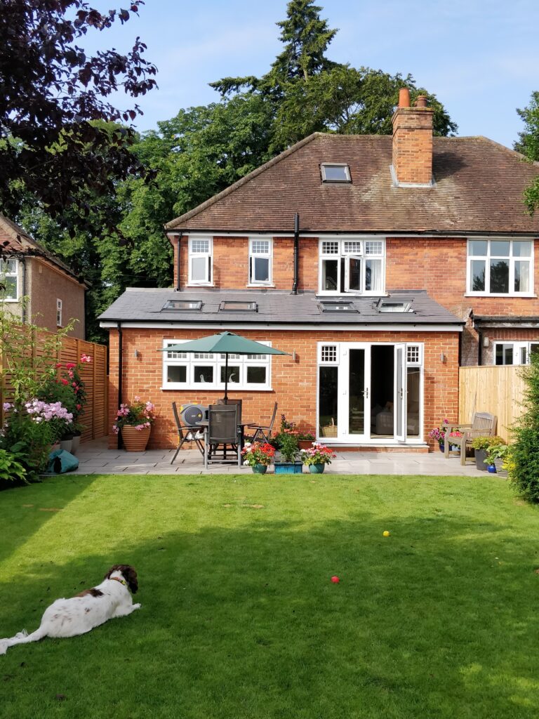
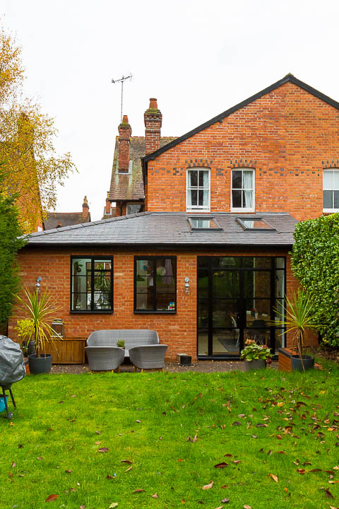
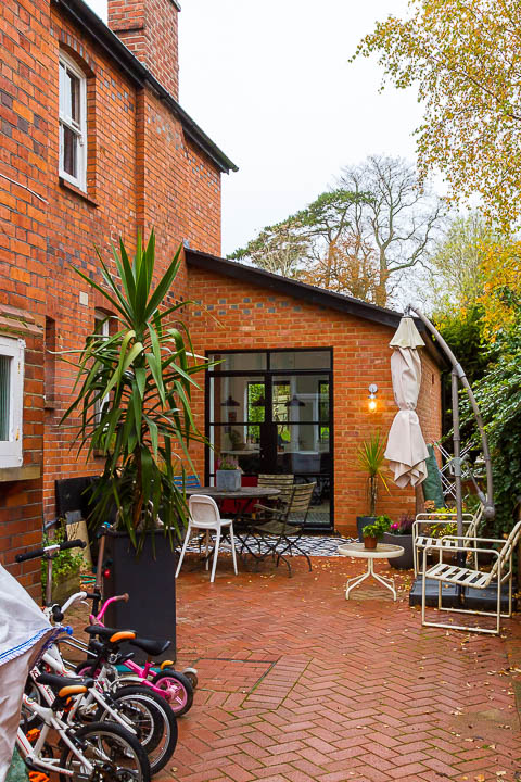
Sometimes traditional materials work best and “in keeping” is an easy win with Planning.

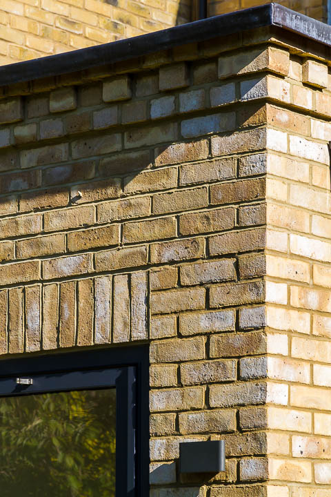
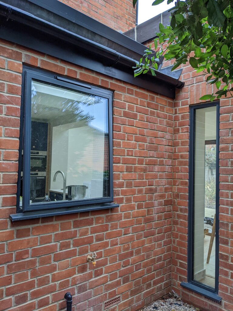
4) Materials make it

A good brick match will make or break a project and a good bricklayer will make the ordinary extraordinary.

5) A glimpse of sun is better than none

North facing extensions are notoriously challenging and you can’t turn your house around. Sunshine brings a space to life, catch it if you can.

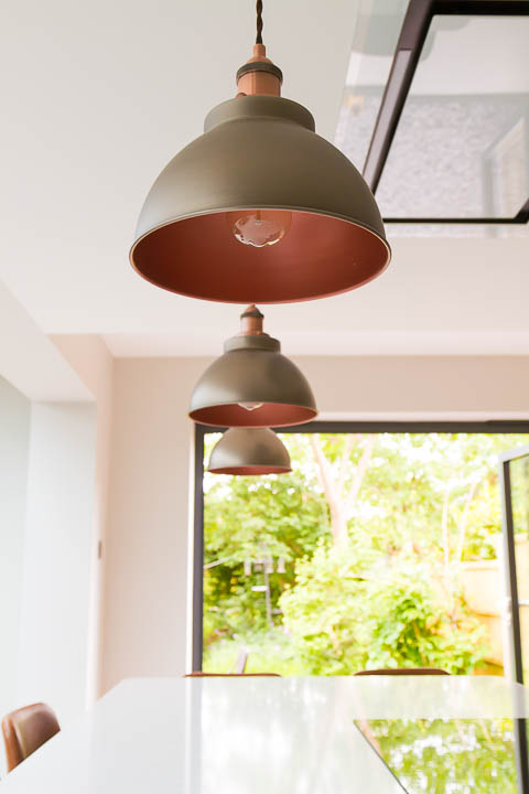
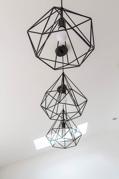
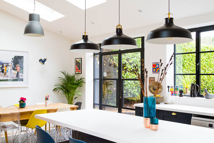
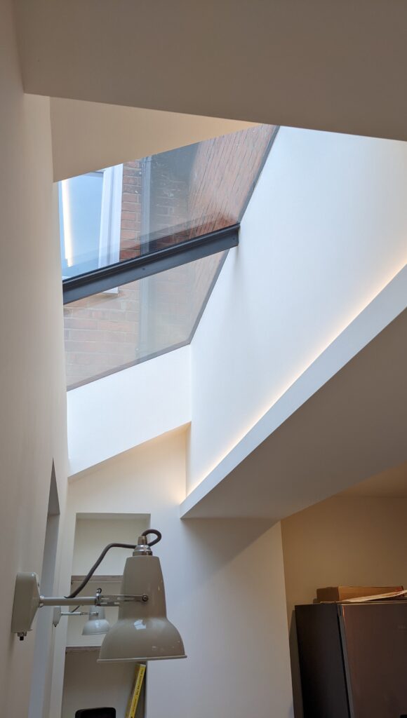
6) Lighting is a language of it’s own

Lighting enhances a home. Choose bold fittings for impact even when the lights are off.

7) Prioritise your budget

Spend money on impact and elements you can’t easily swap later. Quality of glazing systems is usually reflected in the price tag. You can accessorise on a budget if you have a good eye.

8) Alignment is everything

Design it to align it and ensure it is set out correctly on site. When a design comes together as intended the heart sings. A little bit of symmetry goes a long way.

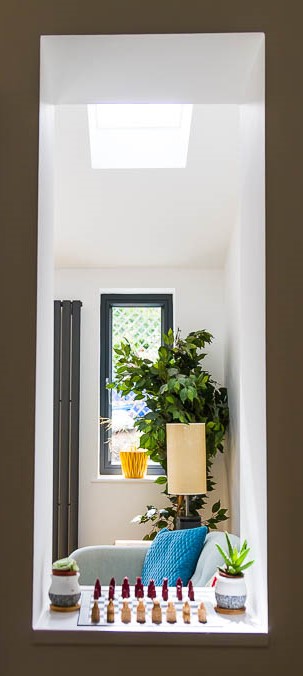
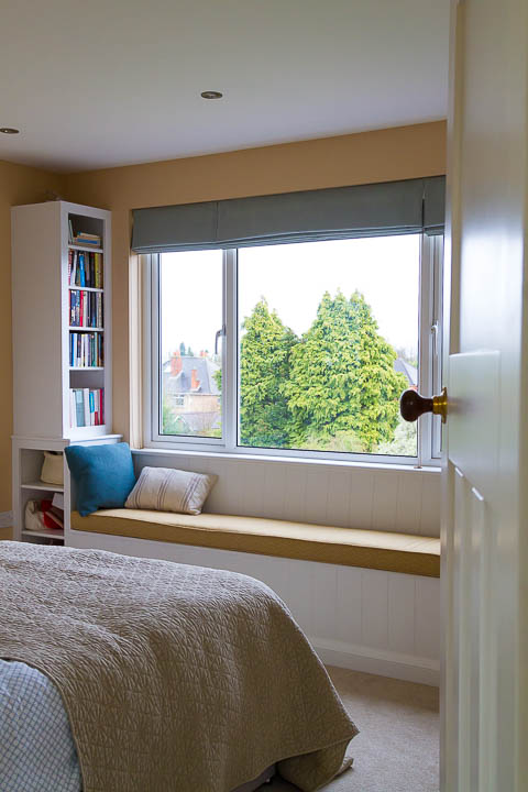
9) Create a quiet nook

Window seats don’t have to be complicated, create a space to escape to.

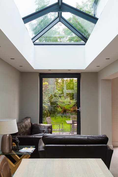
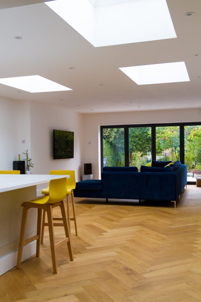
10) Always rooflights

Daylight from the sky is diffuse and even, so including natural light from above is an great idea, especially if you’re extending to ensure the middle zone isn’t left dark and redundant.

What key features will you include in your design brief?

Thinking of a home extension? Got grand plans for a whole house renovation? Get started on your project brief and capture your ideas and aspirations in my Project Planner.

Download the Project Planner here.

What your Conservatory is saying is “Replace me”!

Conservatory: lovely concept but far too hot in summer, too cold in winter. Terrible thermal performance is the number one reason to get rid of it, that’s what it’s trying to tell you! But take care not to replace it with an extension that is glazed to the extent that the same problems might persist.

Poor Performance

Designing a new extension to replace a conservatory is a brief I’m commonly presented with. The main reason cited for replacing it is always poor thermal performance, don’t get me wrong – conservatories have their place but they aren’t very functional for year round family living and if yours is a dumping ground for toys and garden paraphernalia, fear not – there are others out there just like you.

That said, there are some huge advantages in terms of light that come from a fully glazed room. And in replacing a conservatory it’s often the case that you’ll want to go for as much glass as you can, which could in turn perpetuate the same conditions. Fortunately, the Building Regulations have some criteria to help you avoid this in terms of amount of glazing that is permitted before you reach a tipping point. After which you’re required to mitigate your excess glass by “over insulating” other components to compensate, although this is more in relation to heat loss than solar gains.

There are lots of options including triple glazing and solar control coatings to help improve the performance of your glazing and the orientation of your building will be a key factor too. The angle of the sun comes into play somewhat in the UK where it’s low and weak in the winter (desirable) but high and hot in the summer (problematic). If your main elevation is south or west facing, you’ll need to consider the design quite carefully to avoid overheating in the summer months. Solar shading in the form of a roof overhang or vertical fin might be an appropriate solution.

Panorama Overdose

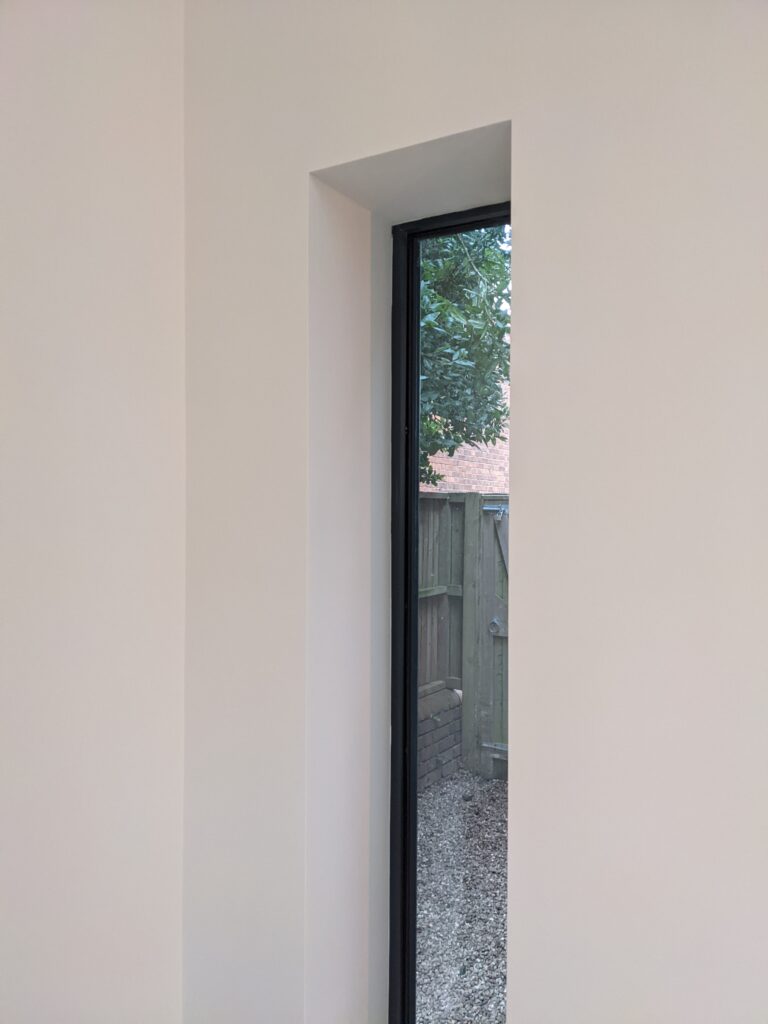
Rarely do people say “I want to replace my conservatory becayse I hate looking at my garden”. But it’s worth considering, do you want to look out on all of your garden or just the best bits?

Frame a view of something worthwhile, mask out the ugly bits. Yes, the apple blossom is nice but do you want to look out at your knickers on the washing line when you’re sat on the sofa… when your friends have popped round to admire your lovely new extension? Maybe not.

It’s also worth considering that floor to ceiling glass can play havoc with your furniture layout, see also Is Open Plan Always The Answer? where it turns out walls have their place.

Design in response to context for the best outcome

Consider your home, why is it like it is? Probably the layout is largely just down to convention. Does it respond to context, orientation for example, any differently to the neighbouring houses? In this article I’m looking at how a large proportion of our homes simply follow convention, and how when extending or altering your home you have the opportunity to change this. Get the most out of your project by positively responding to context, as well as considering constraints.

A very potted history

Conventionally, home layouts, right from your Victorian terrace through to your fairly recent developer housing have little changed. With a front room, back room, kitchen, and bedrooms upstairs. Yes there are differences in scale but overall the functions are the same. The major changes to house design came with the introduction of indoor plumbing, first bringing your loo indoors and then eventually upstairs bathrooms becoming more common place. Our homes tend to have a clear distinction of public/private spaces – ground floor for all, upstairs for the occupants, unless your visitors need to use an upstairs bathroom, in which case you better hope you made the beds! Bungalows and even flats have a similar hierarchy but with less physical boundaries. Have you ever considered it another way?

Unconventional opportunities

I’m not talking about underground lairs or renovating shipping containers, balancing your house on a rock or some kind of mechanical Tracey Island. There are unconventional opportunities to be considered even with everyday homes. Maybe you’re fortunate enough to have great views from your home and you’d love an upstairs living space to take full advantage of it? Conventions are there to be challenged – sometimes there are reasons to do it differently and usually that’s about responding to context.

Context and constraints might appear to be one and the same, but I like look at context as something to respond to with positive interventions, to make a project unique and site specific. Whilst constraints usually fall more in the realm of being the most pragmatic way to approach things. Good design is a balancing act.

Context

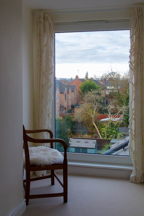
Responding to context could be as simple as positioning a window to frame a view of a beautiful blossom tree. The window in itself isn’t a luxury, you’re going to need one but considering the wider context, the features of the garden as well as the internal layout, brings opportunity to do something a bit special; something more considered – designed. Orientation, working with sunlight is another contextual elements which can inform design but there are other less attractive aspects too which might included noise. In one of my current projects this has meant unconventionally positioning a bathroom on the front of the house in order to act as a buffer between a noisy road junction and the new bedroom beyond.

Constraints

Boundaries are often a physical constraint and one which can’t really be changed. Whilst other things such as drainage or structures can be adjusted with enough careful planning and budget. In one project, the constraint on the width of a new side extension brought about the opportunity to create a fabulous and unconventionally large bathroom with vaulted ceiling and roof lights, rather than simply squeeze the bedroom in to a tight spot.

Constraints are often linked to cost too, so it may mean making sensible choices about where to locate things to work with existing drainage, or to retain some structural piers to keep minimise expense. Throw enough money at it and most things are possible so you might say budget is the biggest constraint, other than regulations.

Good design is about creating a solution that works for the specific context and constraints of your site, not simply taking a cookie cutter approach. And remember, you don’t have to follow convention if there’s a good reason not to, be open to all of the possibilities.